Cloud platforms require a proper understanding of resource configuration and provision. While many companies address this issue by manually creating architecture diagrams, the error-prone process demands time and effort. However, teams can easily skip the risk of error and identify misconfigurations using cloud visualization tools.
What Is Cloud Visualization? ☁️
Simply put, cloud visualization means representing information about cloud infrastructure and resource relationships through a diagram or chart. It makes the process of understanding the cloud environment seamless for organizations. Visualizing data has become a trend in the business landscape that involves cloud computing and big data. It allows you to check out an ever-changing scenario of the cloud environment in a single glance.
Reasons for Visualizing Cloud Infrastructure
There are countless reasons for cloud data visualizations. Here are some mention-worthy ones.
1. Visualizing Complex Resources Relationships
With cloud visualization, companies can map the relationship between current cloud resources and determine configuration details. This is useful for both seasoned and new users to understand continuously changing cloud environments and their elements.
2. Compliance Demonstration
Nowadays, companies store mission-critical data on various cloud platforms. Therefore, it is imperative to ensure data security and compliance. With cloud visualization tools, you can check the compliances. It will also benefit the auditing or compliance teams to audit your cloud environment quickly.
3. Understanding Infrastructure Change
We live in the era of continuous integration and deployment when teams regularly update their cloud infrastructure environments. While validating the change is challenging, cloud data visualization solutions can help DevOps teams to confirm if the changes are done correctly.
4. Pinpointing Misconfigurations
Dynamic visual diagrams help teams review resource and security-related configurations. Users can easily locate invalid and unnecessary elements and work to fix the issue on priority.
Why are Automated Cloud Visualization Tools Better Than Pre-Drawn Templates?
It is possible to manually draw static infrastructure diagrams and update them when a change happens. However, it will take much time for your engineers or external consultants. Since these tools automatically generate and update diagrams, you save valuable resources and time. Now, you should not have a doubt about choosing visualization tools over the manual approach. Here is our list of top-rated cloud visualization solutions:
Lucidscale
Using the cloud visualization tool Lucidscale, organizations can get a detailed view of their cloud infrastructure. It helps you understand how things work by supporting automatic data visualization of platforms such as Azure, GCP, and AWS. Cloud infrastructure visualization helps organizations point out all crucial cloud governance data in place. Also, it helps to locate unidentified or orphaned data components so you can cut down on unnecessary expenses and avoid risk. This platform can generate diagrams to visualize the difference between the intended structure and the existing infrastructure. Thus, you can prevent security loopholes and downtime. The filters of Lucidscale lets you focus on particular elements like virtual machines, VPCs, zones, etc. The automated cloud documentation can also be stored centrally on wiki pages or Confluence. This feature will keep every team member and the external stakeholders on the same page. Lucidscale offers dynamic integration with Confluence, AWS, Google Cloud Platform, and Azure to enhance team collaboration and efficiency. It also applies best security practices, so your data remains safe, and only the right people can access it. Besides, the platform uses 256-bit encrypted connection for data privacy in transit and at rest.
Cloudcraft
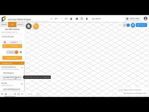
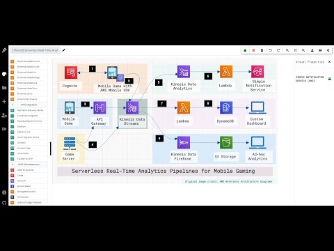
Cloudcraft is a smart cloud visualization tool for AWS diagram visualization. On this platform, it takes only a few minutes to create a professional architecture diagram. Whether it is a new project or an existing one, the tool facilitates a fast and easy method of drawing with its optimized AWS elements. Besides directly adding the doc to your diagrams, you can edit them online with your collaborators. It also supports sharing the diagram with your team and exporting it to presentations, docs, and wiki pages. Here, you can apprehend main services with smart elements for EC2, ELB, Route 53, Lambda, DynamoDB, RDS, Redshift, and CloudFront. It is also available as an API for scanning AWS accounts.
Hava
By adding Hava into your company toolchain, you can visualize the past and present of your cloud accounts in one place. Although your cloud platforms consist of various complex elements, this automated tool lets you create cloud diagrams quickly from multiple vendors. As a result, organizations can check out open ports, security, traffic ingress, configured and running processes, and many more. AWS, Azure, and GCP are the cloud vendors that Hava supports for displaying resources and connectivities through logical diagrams. By choosing each resource, you can visualize its features like connections, subnets, security groups, and ingress/egress IPs. This attribute is highly beneficial for pinpointing anomalies and reviewing business forecasting on cost and management. This cloud visualization platform saves you from manually updating the diagram by constantly monitoring the infrastructure configuration and recording the changes in real-time. Companies can sync and transfer network diagrams to PNG, PDF, Visio, CSV, and JSON files to get the live data. Organizations can also include the data in presentations, reports, and wikis. Apart from these features, Hava also facilitates versioning data on-demand, such as snapshots and historical diagrams. This information will work as evidence that you can submit to compliance and security auditors.
Fugue
Do you want to explore cloud resource relationships, find out about compliance violations, and locate misconfiguration risks? Use Fugue to discover what is in your cloud with a dynamic, interactive, exportable, and visual cloud infrastructure map. With this cloud visualization tool, you can get an in-depth understanding of AWS, Azure, and GCP cloud architectures and the relationship between their internal components. It also makes detailed inspection of individual resources configuration possible. Besides, it lets you eliminate the time-consuming process of creating manual diagrams. Fugue-generated automatic maps and diagrams illustrate cloud compliance to your team, management, and auditors. These also assist you in analyzing historical snapshots. Thus, you can get an idea about how your company’s compliance scenario has transformed over time. From automated visual data, it is easy to identify critical issues that may cause misconfiguration risks. It also reveals unexpected network connections and orphaned cloud resources. Moreover, this platform allows visualization of compliance and its violation as per your cloud architecture.
Cloudviz
After connecting, it is quite simple to get diagrams and documents on AWS architecture. Depending on your company style and other requirements, you can choose from one of its templates to generate documentation. With the help of its diagram editing toolbar that contains a pre-existing library of official AWS icons, generic shapes, and elements, the process of updating the diagrams becomes effortless. To meet varied needs of visualizing different cloud architectures, Cloudviz offers diagram generation profiles. Besides these profiles, users can personalize diagram generation settings and use them later as their profiles. Companies can export the visualization data in the following file formats: PNG, SVG, WORD, JSON, and PDF. If necessary, transferring the synced resource properties is also feasible. With the automated profile, you can schedule your AWS environment diagrams and documentation. This cloud visualization tool also allows embedding generated diagrams into the different dashboard or wiki pages.
Cloudockit
Cloudockit is an example of advanced-level cloud documentation software that can generate architecture diagrams automatically. It supports cloud providers like Azure, AWS, Google Cloud, Kubernetes, Hyper-V, and VMWare. All you have to do is select how much detail you want to include in your diagram, and this tool will seamlessly generate editable cloud architecture diagrams. The tool creates technical documents in Word, Excel, HTML, or PDF format and keeps documenting accurate and updated information. It can understand all the elements deployed in your cloud. Hence, it can easily locate any potential security threats or misconfiguration. Since this platform automatically monitors all the changes in your environment, you save on energy and money. With Cloudockit, companies can closely monitor their cloud expenditure to avoid surpassing their budgets. It also allows exporting data in Excel, PDF, and JSON format. Diagrams generated here are compatible with popular diagramming tools, including Visio, Lucidchart, and Diagrams.net. This platform supports 11 different drop-off locations for diagram and doc storage. Hence, you can get the update where it is most convenient for you. The locations include your storage, email, callback URL, Microsoft 365, Teams, Azure DevOps, OneDrive, SharePoint Online, GitHub, etc.
Holori
Holori helps you in cloud visualization and cost optimization by letting you create multi-cloud diagrams. It visualizes your cloud infrastructure with the help of a template library, customizable elements, and vendors’ icons. Visualizing the complete infrastructure is possible across projects, departments, and geographical zones. Additionally, you can utilize it to locate any unused or unidentified element and thus avoid security breaches or unnecessary costs. This platform can also alert you upon identifying points of failure. It supports real-time collaboration with teammates and lets users markup directly in the document or diagram. You can readily share the completed project with other teams. Companies can also export and deploy the cloud architecture by connecting Holori to their cloud provider. Moreover, cloud visualization diagram export is also possible in JSON, PDF, and PNG formats.
CloudSkew
Are you looking for a cloud visualization tool mins the hassle of installation? CloudSkew is here for you. This online diagram generator and editor also function as a cloud diagram repository that saves your diagrams automatically to its cloud storage. It comes with a built-in document editor that lets you add notes to your documents, network diagrams, and flowcharts. While creating diagrams, you do not need to search and download symbols and icons separately. This platform comes with a canvas of infinite size. Any diagram you make here gets autosaved on the cloud, and you can share, print, or export it. It contains an icon library of top cloud platforms like AWS, Azure, GCP, Kubernetes, IBM Cloud, Oracle Cloud (OCI), and so on. Above all, CloudSkew has a minimal UI without any complex workflows that you can run without difficulty.
Hyperglance
If you find it hard to understand the configuration and the relationships of your complex cloud infrastructure, Hyperglance is here to help you with interactive and intuitive cloud diagrams. Now you can see all your cloud inventories, including AWS, Azure, and Kubernetes from one view. Both the diagram generation and update take place automatically and thus, save your time. Hyperglance is a scalable platform that grows with your business. This cloud visualization platform offers additional features like viewing detailed metadata, switching between cloud platform and search results, exploring resource dependencies, overlaying metadata into diagrams. One can export diagrams to PNG, CSV, or Visio formats. Users can even automate the export process using REST API or schedule it to a specific storage account.
Kumolus
With Kumolus, users get to visualize their cloud services without any coding. It takes only one click to dynamically visualize your existing cloud facility and network topology in real-time. Companies can also import their current deployments with read-only access to skip any security risk. As you draw a diagram on this tool, it will automatically generate code. Thus it saves you from hours of coding efforts and eliminates any chance of errors. This platform supports stack diagrams for networks and applications. Moreover, the document gets updated automatically when you draw the diagram or edit it using any native or third-party tool. You can also export the diagrams with all configuration settings to your wiki pages and reports. Kumolus allows you to set up RBAC controls for multiple individuals and teams to visualize and provision cloud platforms. You can also utilize it to calculate cloud services costs as it adds the cost of any deployed service to the diagram in real-time. Using its services, you can ensure deployment of the right configuration, increase deployment speed, and reduce risk.
Wrapping Up 🧑💻
As more organizations opt for cloud solutions, visualizing the cloud data has become the need of time. Automated cloud visualization solutions make cloud data demonstration effortless than the manual approach. Here, we discussed top platforms that offer data visualization services. Besides enterprises, small and medium companies can also utilize these tools for business resilience, improved communication, and smooth workflow. To excel in cloud computing, you might want to get additional training from different free resources.

![]()


